A project I completed during my diploma of a set of 52 playing cards with various facts about typography including: typefaces, elements and principles of design, anatomy of type and "type crimes" such as widows and orphans. I also completed a design for the back of the cards. The cards were created in InDesign and Illustrator. Below are a small selection of a few cards from the pack as well as the design for the back of the card, and the full 52 cards and concept sketches for the card back design.
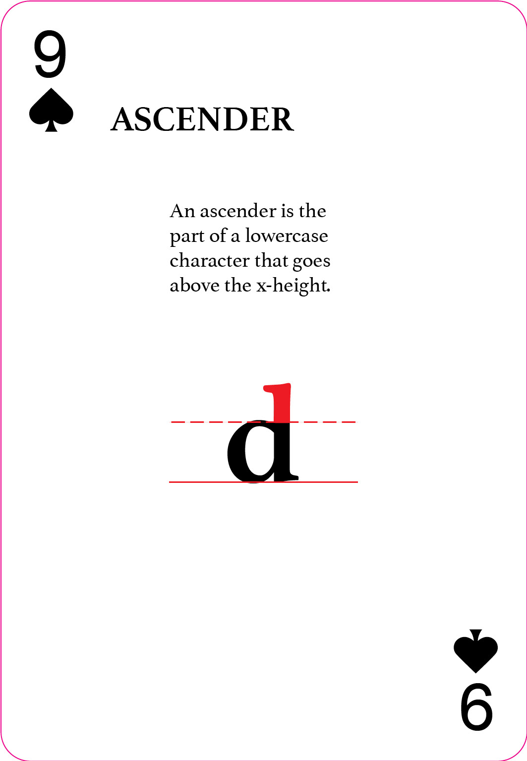
Ascender card. A lowercase d is shown, with the ascender part of the letter in red, intersecting with red lines showing the x-height.
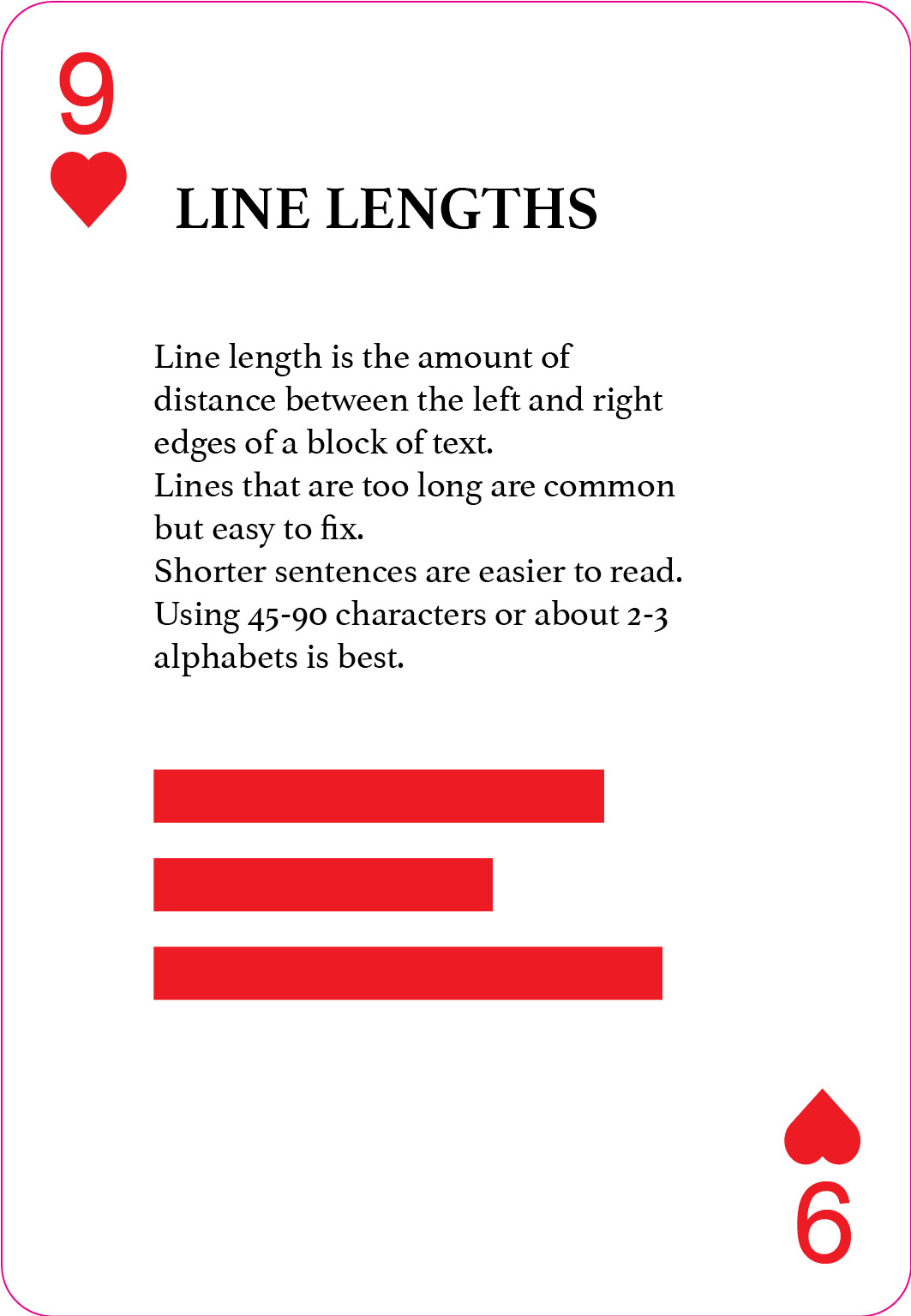
Line lengths card. Several thick red lines of various lengths illustrate line lengths.
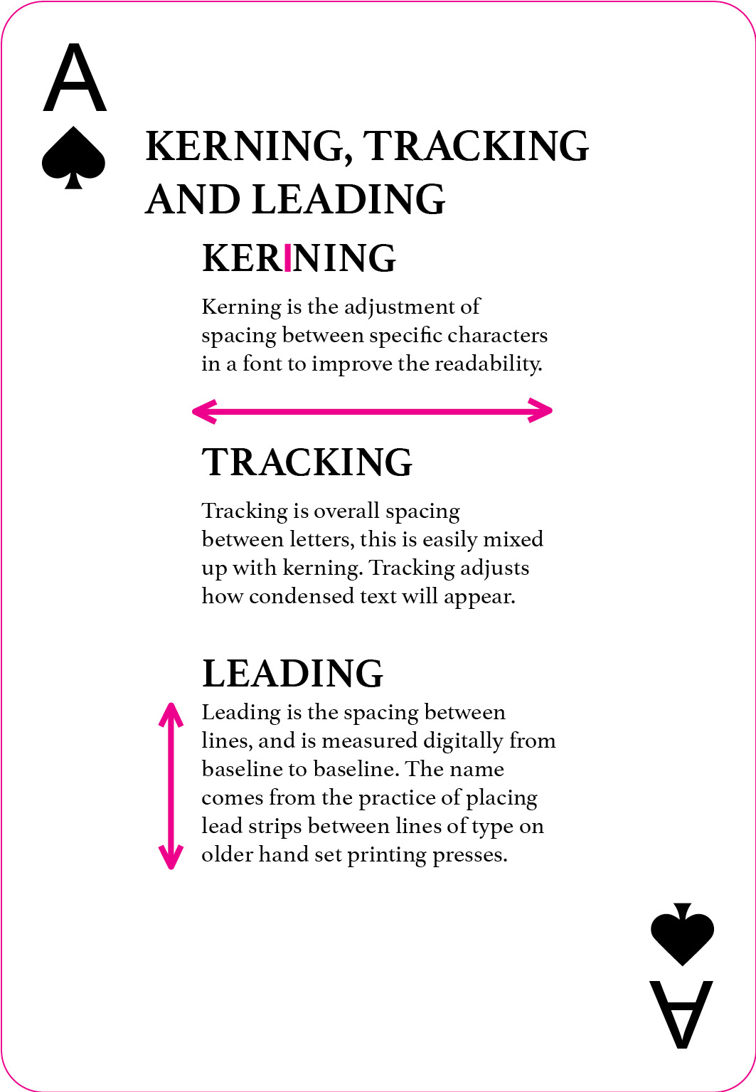
Kerning, tracking and leading card. Red and pink lines show the differences between kerning, tracking and leading.
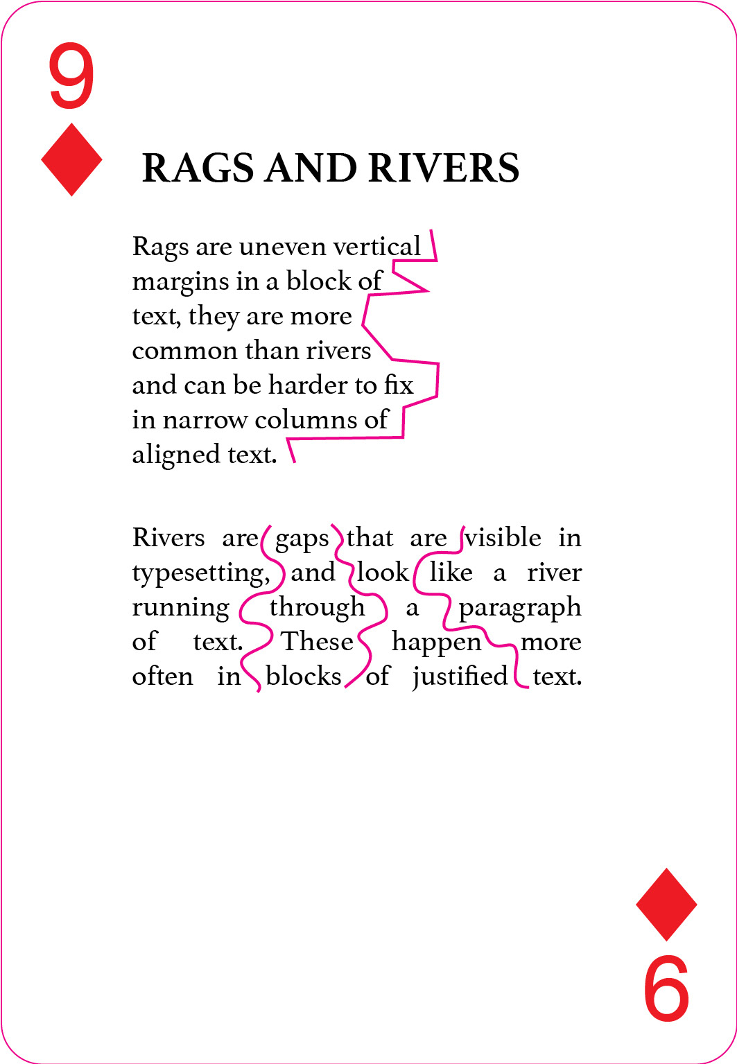
Rags and Rivers card. Jagged pink lines run along the outside of the paragraph and rivers run through a paragraph of text to illustrate the differences.

The back of the cards. A black rectangle frames vertical text that reads "Typography" in all caps in a sketchy serif font.
The full set of 52 typography fact cards, including aces, spades, diamonds and hearts.
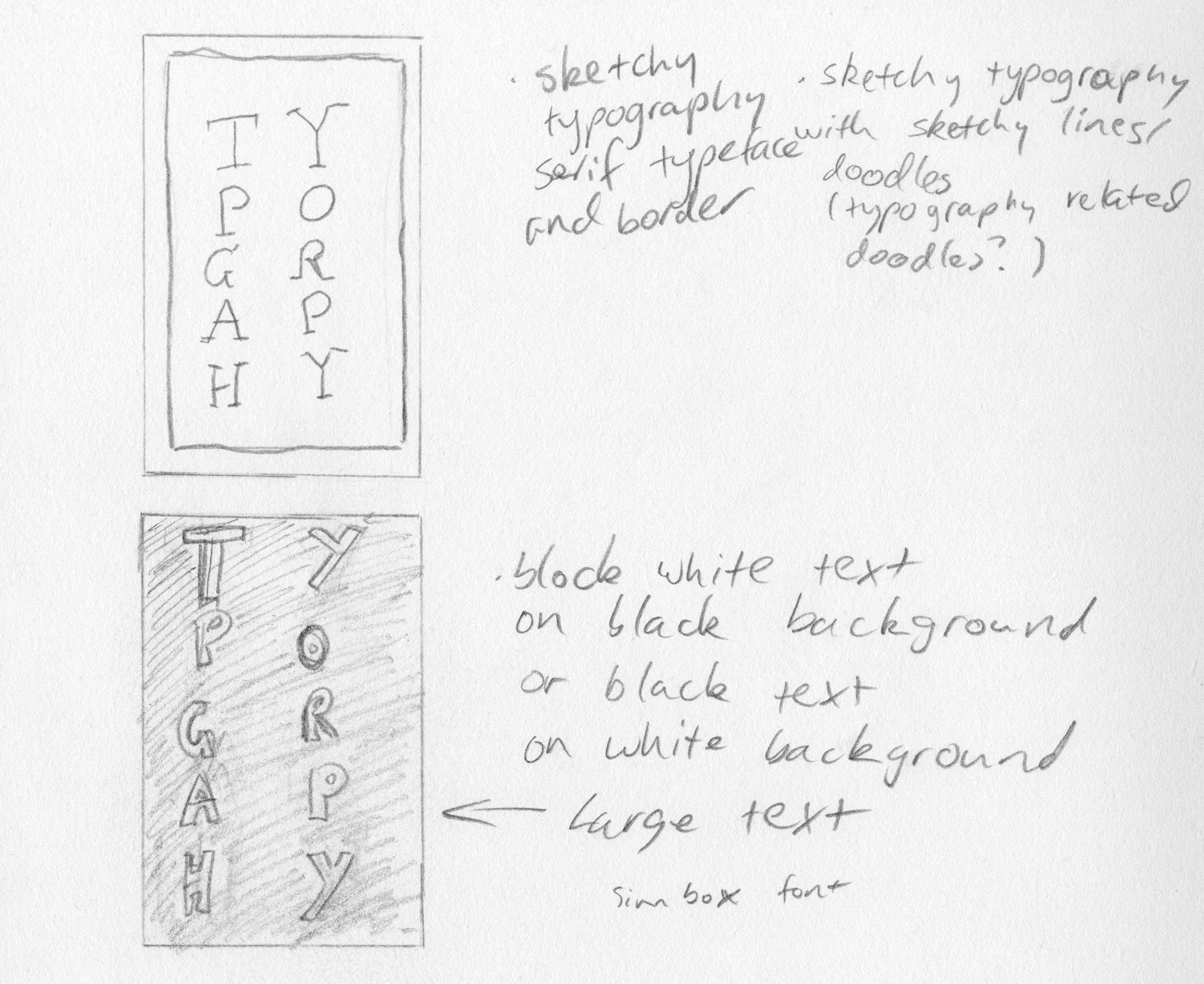
Concept sketches I drew experimenting with different styles to use for the card back design including art deco, geometric patterns similar to arcade carpet patterns, hand-drawn stylised fonts and minimalist block text. I explored different styles and themes to see which ones would work best with the 52 cards and went with the vertical type hand-drawn serif font.
Having the type filling a vertical space meant I could fit more characters in as well as avoiding having too much white space. This design also received the most positive reaction and feedback from the people who saw these designs.

Pencil sketches of various designs for the card backs, including art deco, memphis and bold typography.
