A project I completed during my Advanced Diploma for a baby food branding for a Kraft-Heinz Australian-themed baby food product, named after an Aboriginal word for "baby". I designed the logo to reflect an Australian animal and to connect the brand to nature, the colours used were chosen to reflect soft, pastel themes for infants and to also connect the platypus to the water environment it lives in.
The logo and elements were created in Illustrator and stock images of the fruit were used from Adobe Stock. A style guide for the brand was also created in InDesign with guidelines on logo and colour variations, clear space, minimum size, typography, correct and incorrect use and placement.

Bubup logo featuring a platypus

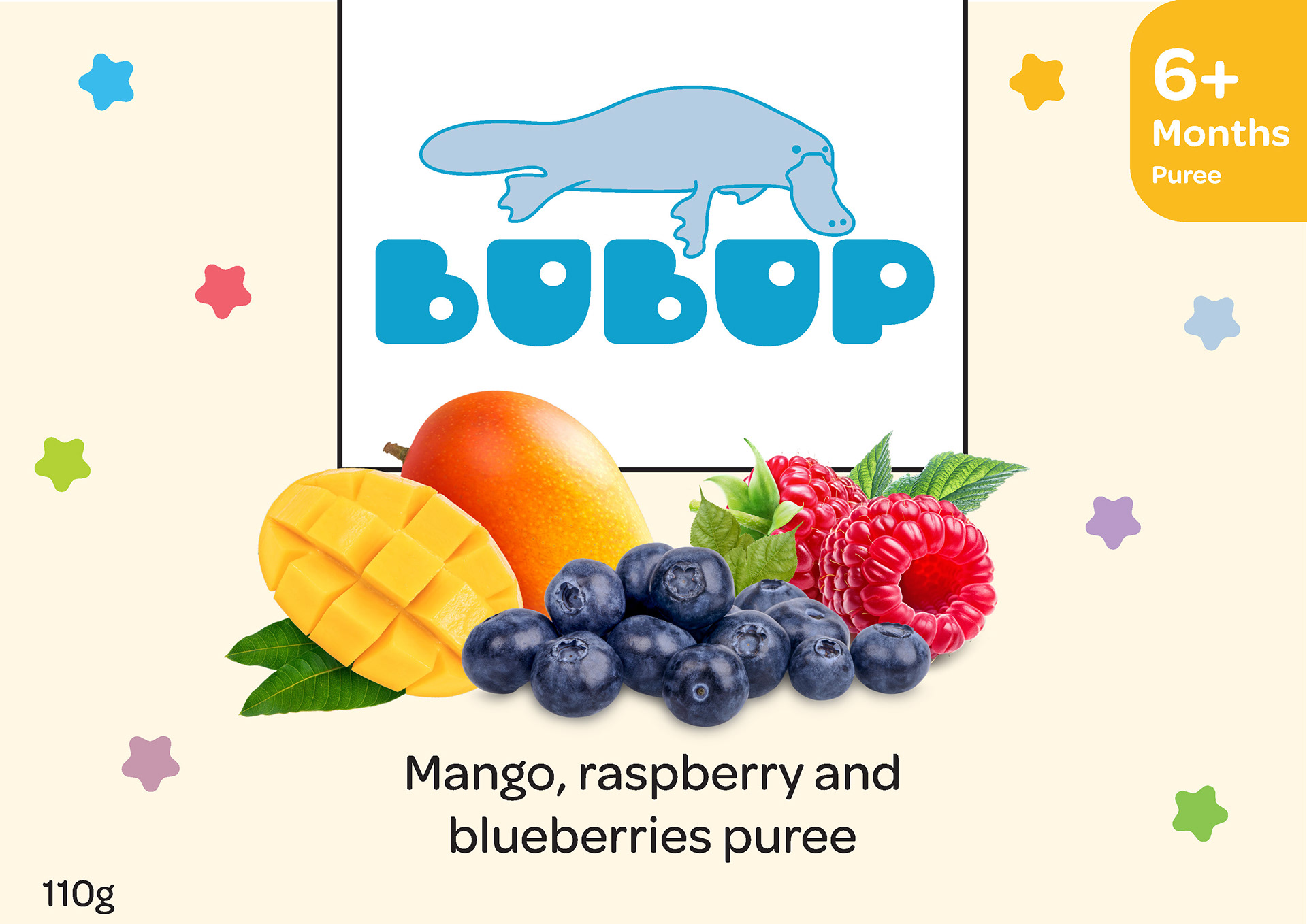
Bubup logo and packaging for one of the baby food products.
I also designed a packaging flat sheet featuring paper stock information, applications, environmental credentials and assembly instructions for the removable packaging which would contain jars of the baby food and two of the animal mascots (not featured on the food packaging) which can be removed and folded to stand upright. I used colours from the brand's identity colours with additional shades with a light blue wave to represent a river running across the different sides of the packaging, reflecting the environment the platypus in the logo lives in.
Created in Illustrator and InDesign with supplied paper stock information and logos and icons.